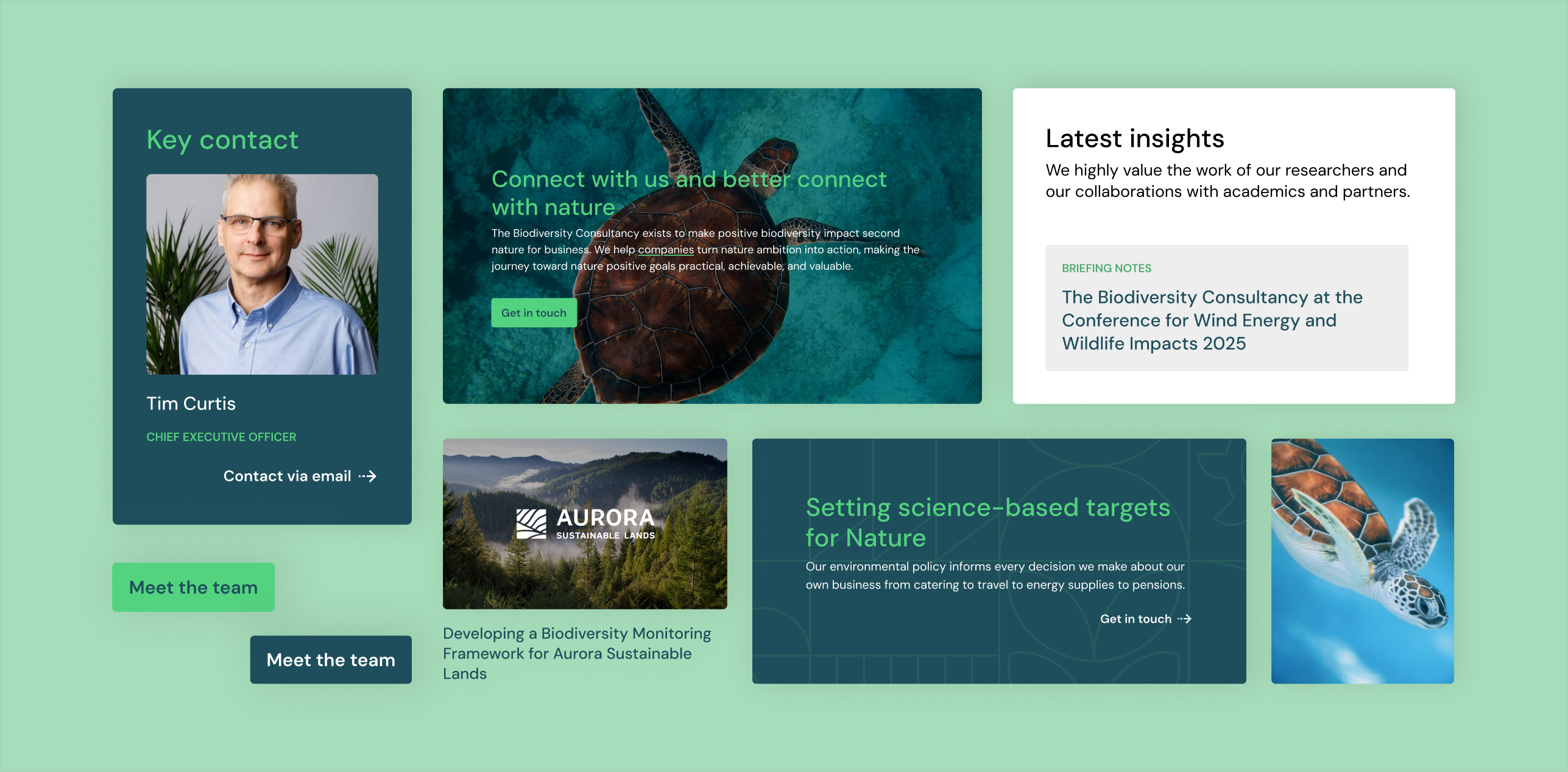
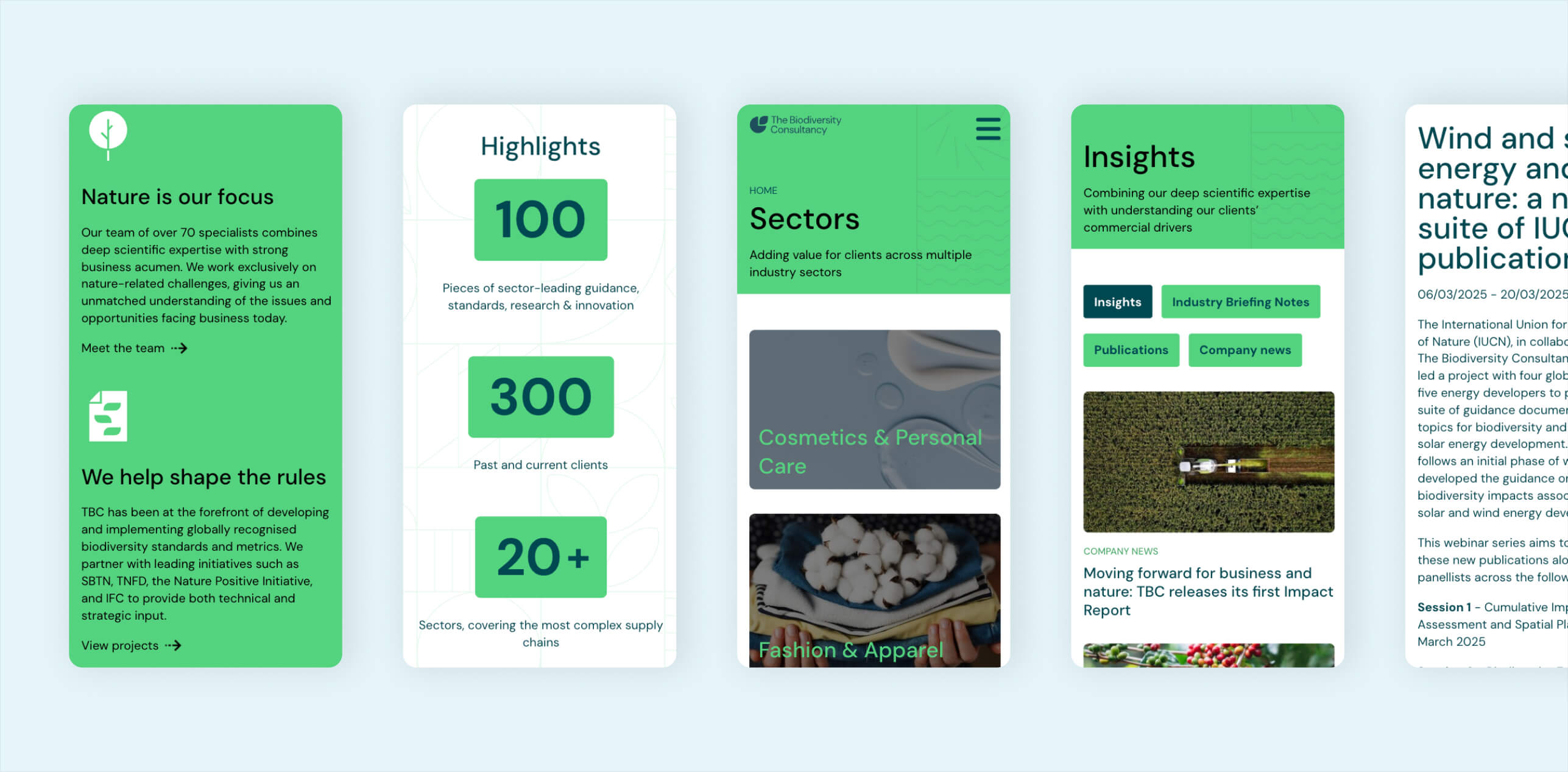
The Biodiversity Consultancy, a company already on retainer at the Liquid Light agency, has had a rebrand which they needed implemented onto their existing website. Already having a website built within the agency's framework, this provided an advantage timeline-wise, cutting corners when it comes to the back-end development and ensured a fast delivery process for the client.
Client frustrations
- Brand refresh: not represented on the site
- Unclear messaging: feels more like an NGO rather than a client-facing service
- Lack of positioning in the market: why are we better than our competitors?
- Dead-end pages: static pages end up with unclear calls to action, leading nowhere
User frustrations
- Difficult to understand what the organisation does
- Confusing user journeys: multiple calls to action in the same viewport leading to no action taken in the end
- Projects didn’t reveal much at first glance, adding to the confusion
Process
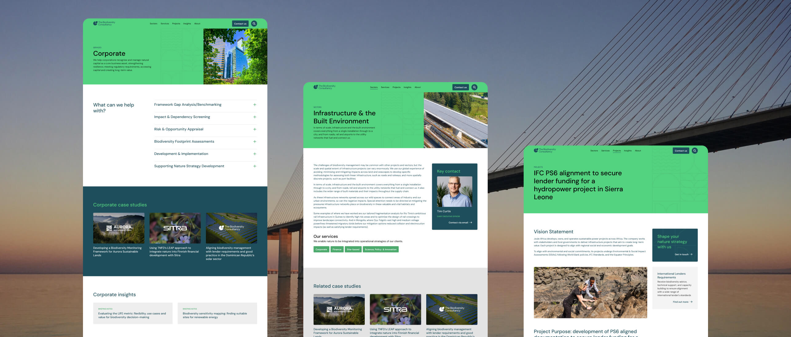
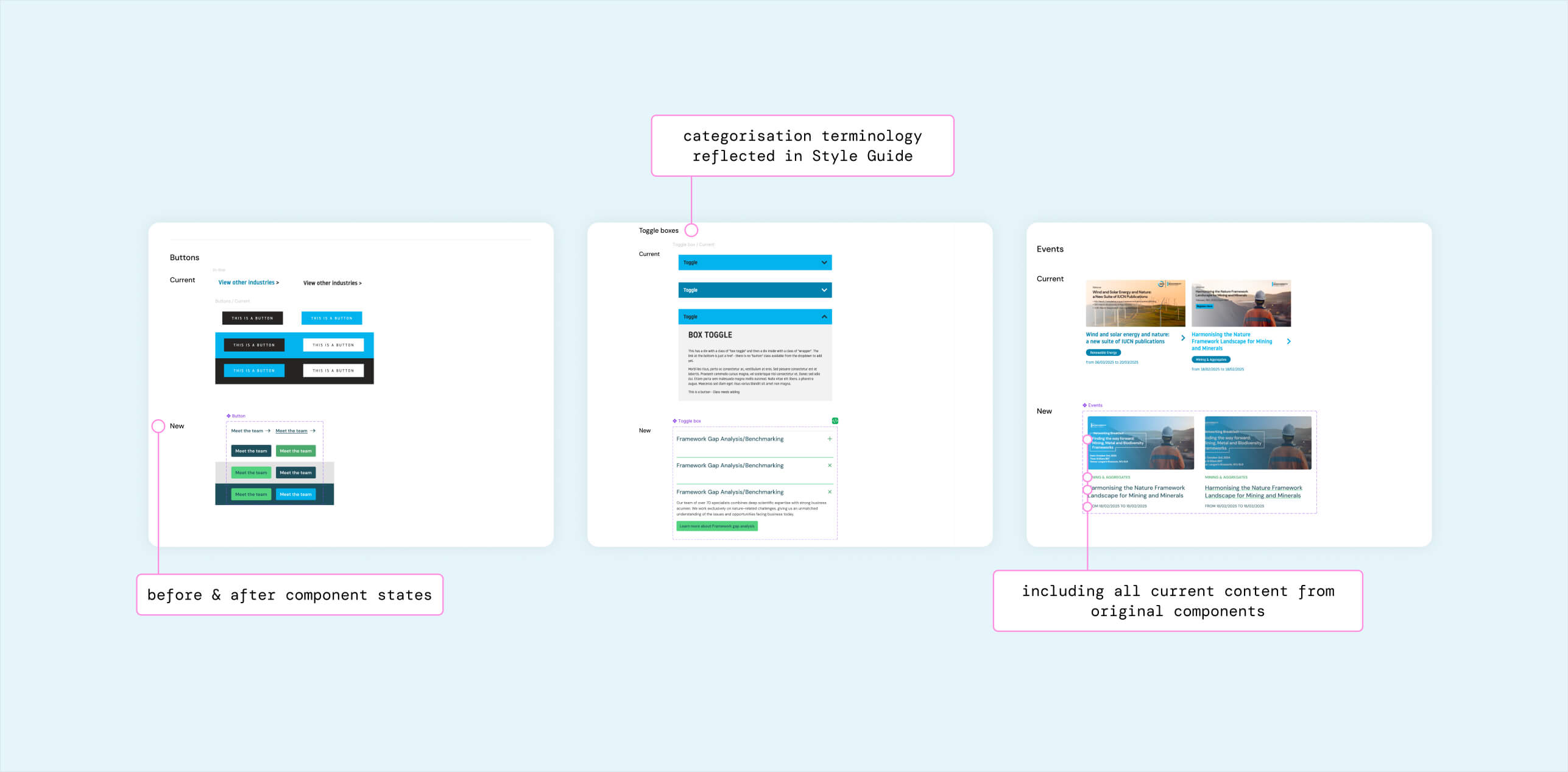
The key UX changes on the website were the following: sitemap, homepage, services and sectors. Therefore, throughout the wireframing stage these items were the focus; the rest of the pages and their structure would remain untouched. This meant that the reskin, i.e the redesign of the existing style guide, would have to work seamlessly on every page with the live content.
The goals raised for the future services and sector pages were the interlinking and encouraging users to stay on the site, as well as having a clear point of contact for each service available. The live pages were indicating calls to action left and right, lacking a hierarchy; this seemed to have been lost after years of website content-management updates from the client.
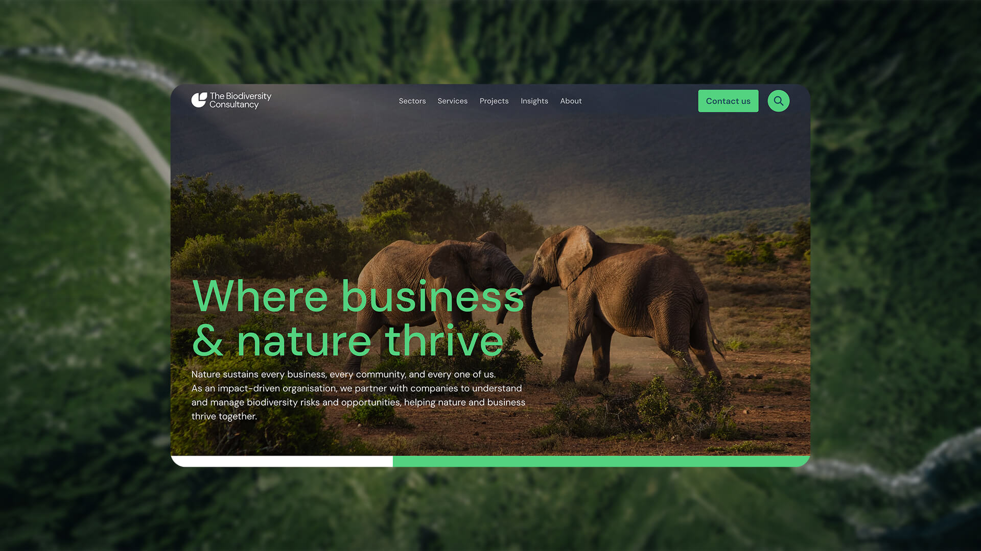
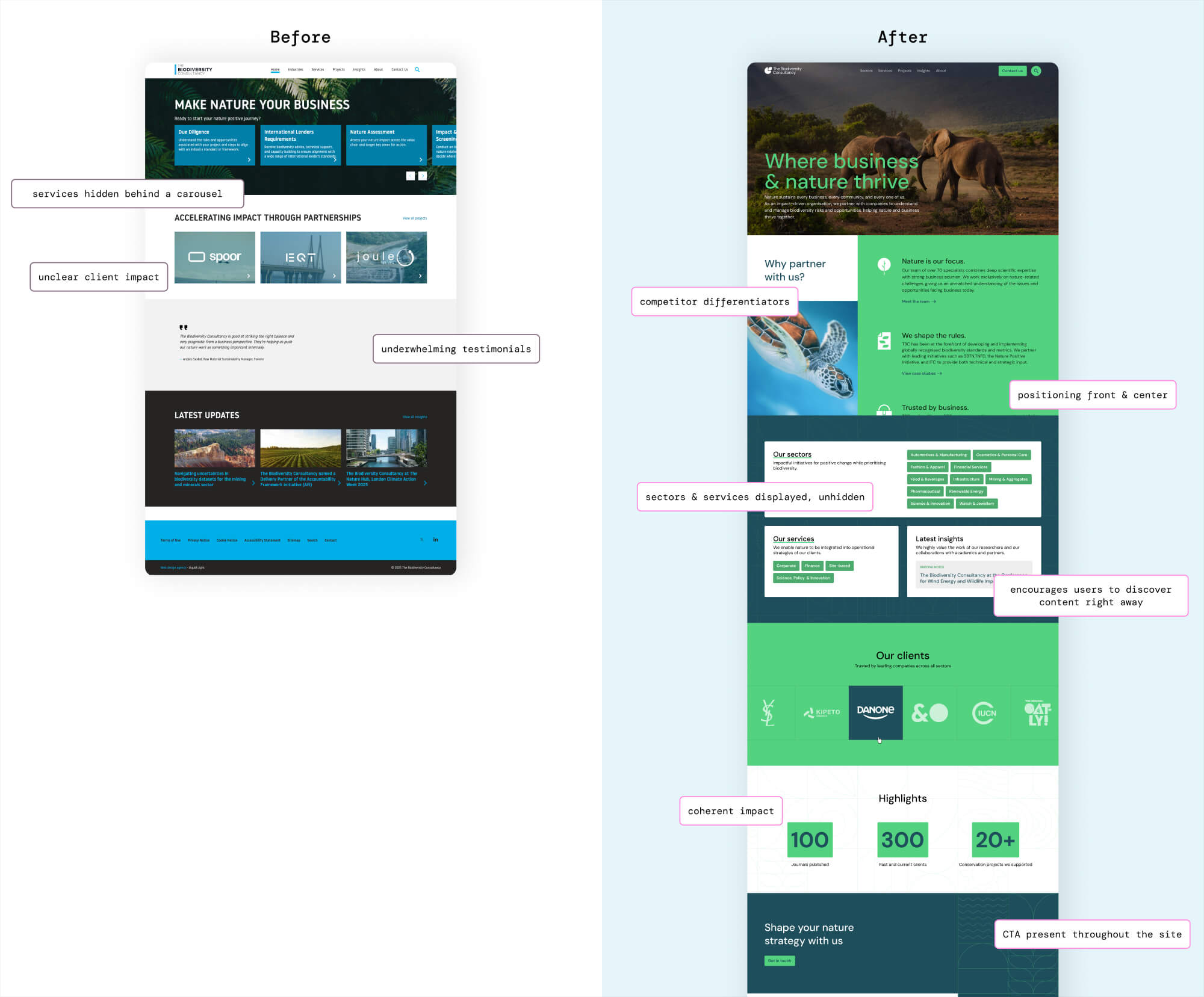
There was also the homepage: the research indicated that the initial user’s reactions when landing on the website was confusion. The overall branding, along with unclear messaging, lead users to believe that TBC is an environmental not-for-profit organisation, rather than a professional services firm working with businesses to align those with biodiversity standards.
The UX path was clear: showcase the services and sectors front and centre, provide appropriate messaging that proves the expertise of the consultancy, and highlight the unique selling points that differentiate TBC from their competitors.
Outcome
Within a tight deadline and retainer budget, we managed to deliver a brand-new looking site that checks all the boxes. The only new components being 3 sections on the homepage, keeping the rest of the site design system as it was built in the back-end, mostly collaborating with front-end developers to refresh the look and feel of the site. Not only does the update apply the new branding, it also provides a clear user experience for its audiences to understand what The Biodiversity Consultancy stands for, and receive the information they are seeking.